
Pantone colors are often looked upon as inspos by architects and designers. The use of Pantone colors will open up new combination- possibilities for hospitality projects.
Colours play a vital role when it comes to Architecture and interior design. They express emotions, convey the aura of spaces and add beauty to the design. In a nutshell, colours shape our experience of the built environment. From the bright hues of a tropical resort to the stately neutrals of a classical mansion, colours can set the tone and create the mood of a space.
Architects and designers often look to the Pantone Colour Guide for inspiration when choosing colours for their projects. Ranging from bright and cheerful to subdued and calming, these colours have a way of communicating emotions and meaning that transcend language barriers.
Touching on creating a stunning hospitality project, one of the most important elements to consider is the colour palette. We all know that first impressions count, and nowhere is this more true than in the hospitality industry. And what better way to ensure that you have the perfect colours than to take a cue from Pantone, the world-renowned authority on all things colour! Choosing the right Pantone colours is essential to create a cohesive and inviting space in the hospitality industry. Not only do these colours play a major role in creating the overall aesthetic of a space, but they can also influence the overall mood and atmosphere. They are in fact a great way to add personality and style to any hospitality project.
Pantone has recently announced its 2023 Colour of the Year: Viva Magenta. This vibrant crimson-red shade is the perfect balance of warm and cool and is sure to add a touch of excitement to any space. Vibrant and alive, Viva Magenta’ seems to be the perfect choice to inject some life into hospitality design. There’s something about this colour that just screams “welcome!” If you are looking for a unique and stylish way to add some personality to a hotel lobby or hallway, consider painting the ceiling in a vibrant Viva Magenta hue! This also works for flooring; a Viva Magenta carpet runner in a hotel lobby would be absolutely stunning or a magenta rug in a high-traffic area can really make a space pop up. Accent walls, artworks, or even upholstery are other ways to use this electric hue. Incorporating this trendy hue would instantly jazz up any minimalist or monochromatic space.
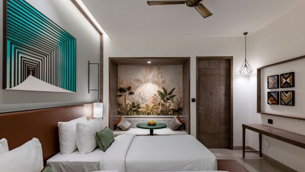
Often architects and designers tend to mix and match traditional and modern styles in hospitality projects to create spectacular spaces. They strive to take the best of both worlds and create something truly unique. This makes it quite interesting and accords character to the space. Maybe it’s the juxtaposition of the old and the new, or the way that the two styles complement each other. Traditional design elements can be given a modern twist with the use of Pantone colours.
When it comes to architecture and design, there are endless possibilities in choosing colours. You can plump for a bold and eye-catching look by pairing two contrasting colours, or create a more subtle and sophisticated palette by choosing colours that are in the same family. Pantone colours immensely aid in creating a range of different looks and styles. Conceivably, it’s the way that they seem to capture the light, or the way that they can be blended to create an infinite number of shades.
A unique architectural experience can be created by incorporating Pantone colours into the design of hospitality projects. Perhaps it’s the vibrancy or the way it seems to invite people in, this rich hue is sure to make a statement and add a touch of luxury to any space. The right use of Pantone colours creates a sense of harmony and balance within a space which is one of the most pivotal aspects of any hospitality project.